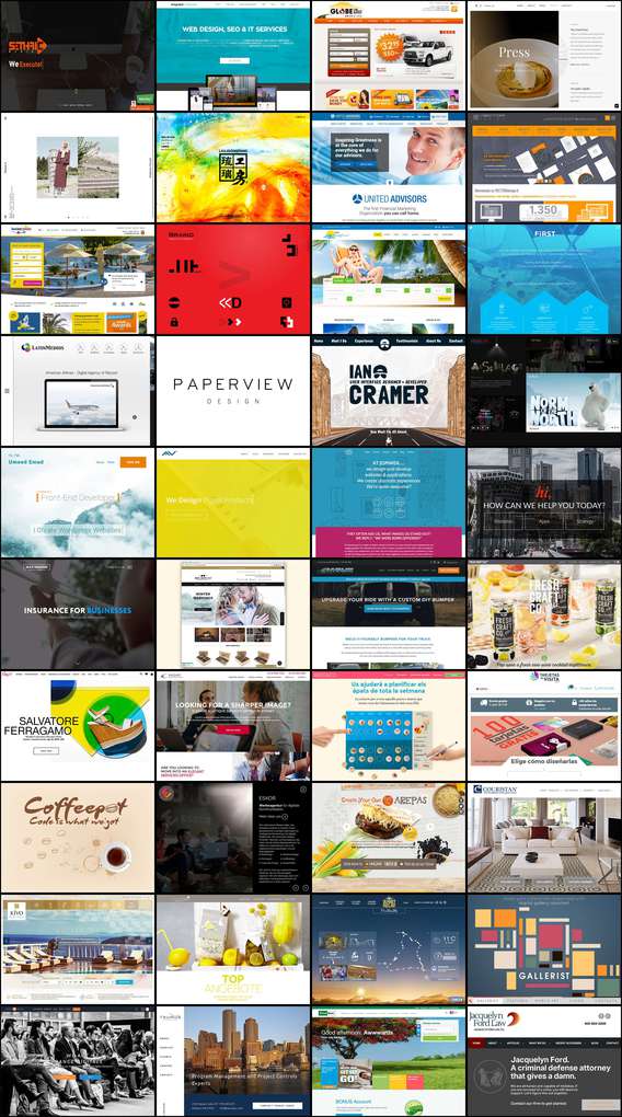
I struggle to keep up with trends in web design. It all goes back to solid fundamentals but I like to try to stay abreast of what is currently fashionable. This is an exploration of partially automating that assessment.
I got to thinking about how to keep up with design trends with a minimum of effort. In particular I struggle with color, I can recognize things that I like, but if I just sit down with a blank slate I struggle to create something visually interesting. Due to this, lots of my work is done in greyscale. I've been thinking about how I could keep a pulse on what is trendy now without having to dedicate too much time to the process.
I recently found Awwwards.com, which claims to be "The awards for design, creativity and innovation on the Internet". Promising start. Problem being, I don't love their site. It's full of rankings, links, descriptions and a host of other things I don't care about. What drew me to the site was how they've essentially editorialized a bunch of sites that I'm probably never going to stumble across on my own. They also provide screenshots of those sites. This last bit is key here.
The "awards" page fits 12 "winners" to a page and they've helpfully paginated their URLs as such:
http://www.awwwards.com/awards-of-the-day/?page=2
Since what I really want is just a 20,000 foot view of trends, I'd like to just compress all of my clicking and scrolling into as few actions as necessary. The images on each page are located in a non-browseable directory based on year/month
http://www.awwwards.com/awards/submissions/2015/05/5563551e61b26.jpeg
My first goal here is to get all of those thumbnail images in one place. I think
cURL seems like a good choice for iterating through those pages. It looks as
though 25 pages gets about a year or year and half of trends, which seems
sufficient.
curl http://www.awwwards.com/nominees/?page=[2-25] >> output.html
Which will land you with a big honking page of HTML (about 25k lines). Let's
filter out all of those image links, I'm fairly confident I won't run into
anything problematic with the following regex. It's just creating a capture
group on strings matching /awards/submissions and ending in jpeg and passing
that off to build the full URL.
sed -n 's/^.*\(\/awards\/submissions.*jpeg\).*$/\1/p' output.html \
| sed 's/^/http:\/\/www.awwwards.com/' > image-links.txt
http://www.awwwards.com/awards/submissions/2016/03/56f159f666acf.jpeg
http://www.awwwards.com/awards/submissions/2016/03/56f1a25d1ea79.jpeg
http://www.awwwards.com/awards/submissions/2016/03/56f1fc1b6fcdd.jpeg
http://www.awwwards.com/awards/submissions/2016/03/56e2a4d6d8a0c.jpeg
http://www.awwwards.com/awards/submissions/2016/03/56e2107ed369e.jpeg
...
There are, in total over 200 images in those 25 pages. It is simple enough to
download them all, I like wget for this kind of thing:
wget --no-parent -P images -i image-links.txt
So now I have 243 images, about 35MB total. I think what I'll try is a kind of
contact sheet. Imagemagick is supposed to be capable of doing something similar
with the montage command.
  montage -geometry 700x500+5+5 \
          -background none \
          -quality 60 \
          -tile 4x
          images/*.jpeg images/output.jpeg
The geometry here is simply maintaining the original image sizes, the +5+5
specifies the padding between images. The -tile command is fixing the output
at 4 images wide. I am turning down the quality because the result would be
obscene otherwise, I'm keeping the same resolution here but that might make more
sense to turn down with the drop in quality. The resulting image is just over
8MB and comes in at about 2800x31000 pixels.
The above sample is limited to just 40 images for the sake of bandwidth, the
resulting image is still quite large (1.2MB 2800x5100).
As a one-off it's easy to browse for a palette that appeals to me and to get a sense of current trends in web design. It appears hamburger menus, hero images, and transparent navbars are here to stay, pity. I've been browsing for similar sites and happily found several that follow a similar pattern. What this ultimately means is this process should be repeatable in at least a few contexts.
I'm thinking of how to generalize this kind of thing to identify the dominant colors/palettes in use; something like what Charles Leifer did here. My impression so far seems to be I need to derive each images color values into a different colorspace than the traditional RGB. Current reading is: Color Detection, DeltaE 101, and this HN thread.