It wouldn't be right to pick on Firefox all the time, so here I document bugginess within another program I have to use frequently, Slack.
I realized that the last few times I complained about Firefox1,2 I may have given the impression that it was the only thing troubling me. Quite the contrary, I find bugs all the time and just live with them. Here's a few bugs in Slack and a few guesses at why.
Here's a quick summary of a fraction of the elements of Slack's user interface. I'm interested here in just the right sidebar.
Any of the above can be closed with a typical ⮿ button located at the top of the right sidebar. Another option is to use the back navigation button.
For those keeping track at home, that's four elements of the same portion of the user interface (the right sidebar) with four different means of opening them (link, icon, menu item, keyboard shortcut). Additionally, the different elements don't have symmetrical modes of operating so the means of closing can vary.
As an interesting example of how some of these features interact, I've included a video here. In it, I open and close channel details and with both the close button and the back button. Interesting to note, if you go back (so that no sidebar is visible), then view a thread, closing the thread reveals the channel details. If you are like me, you might expect that such behavior implies a stack of menus or similar paradigm. It does not.
I then go through how repeating the action in the other order, from thread to details does not exhibit the same behavior. Closing the channel details closes the right sidebar, regardless of the action leading up to it. Oddly enough, the behavior of the channel details toggle and close button are both unlike the operation of the back button, which does in fact treat the backward movement more like a stack of menus.
I don't really know how to count that, if I wanted to tally the avenues of user interaction. I do have the sense though, having looked at it and tried to understand how the UI works, I am actually less sure what will happen for any given action.
The sidebar is a dumping ground for anything that isn't the main conversation or a popover; this includes threads. Overloading the information sidebar (and isn't that what it is, really?) with threads means incorporating navigation, because they aren't threads, they're second-class channels.
The navigational buttons interact too awkwardly with the right sidebar for them to have been designed together. With movement through a series of channels the navigation buttons make sense, you can retrace the steps you took through the channels. This metaphor breaks down with the sidebar though, the navigation buttons open and close the sidebar and the associated threads or menus. Is this really a change of location in the application? It doesn't feel like it.
Combine the above oddities of navigation with threads, where channels are presumably the unit of navigation and you realize how bifurcated the interface is with threads in the right sidebar.
It is true, the above probably couldn't be submitted in a bug report. They are undoubtedly working as intended but that is the problem. Poor conceptual models are actually worse than bugs in some cases because they're pervasive, I'm sure I can look forward to more feature accumulating in the right sidebar. Additionally, poorly expressed models are difficult to address. You can't really fix navigation because that would require you to clarify what threads are or are not, and I've seen no indication that anyone knows the answer to that.
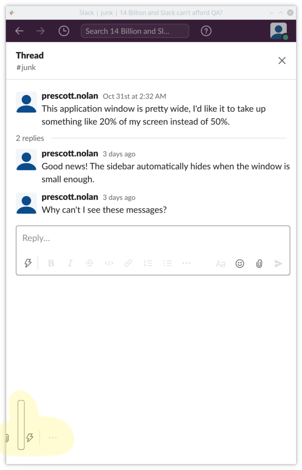
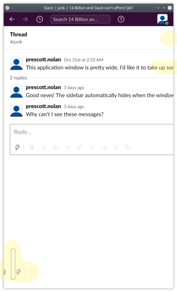
I hear you though, I promised bugs so here are some bugs. Resize Slack so that it is taking up only a fraction of the screen. I assume you, like me, have actual work to do that doesn't involve chatting in Slack. Now open a thread and check out the conversation pane:

Sure that looks bad, but you can grab the pane/divider and drag it leftward to conceal the main conversation pane and view only the thread. Sort of:

Just be careful you don't keep dragging the pane/divider to the left, because there's nothing to stop you and you can lose both your text and your close button:

Any of those issues are pretty minor but I think they point to the same root cause, which is really addressed in the first part of this rant. Slack's thread interface is poorly considered and tacked on without any real consideration as to the whole.
I've been happy enough using Ripcord. It does a lot less but it does it better. The developer (and I think there is only a single developer) calls it alpha-shareware but I've not experienced any real problems. The whole application takes something like 20MB and launches instantly. The only real missing feature for me is audio-video calling. I wouldn't even mind but for the fact that work requires I occasionally join a call, prompting me to open the Slack app, which inevitably takes ages to launch.