The other day I re-worked an SQL query used for generating a code review visualization. Today I spent some time rethinking the utility and complexity of such a silly little program.
Much of the work of the original program is reaggregating data and then reformatting it for consumption by matplotlib. While the result is interesting, I'm not sure it is worth the complexity involved. As a measure of the complexity I decided to re-invent the graphic using different tools. In this new case, I switched matplotlib for gnuplot and Python for SQL.
I intentionally left out some portion of the original program, specifically that piece that does a network request to the code review server to fetch information on reviews with multiple reviewers. With some time spent on the existing program I've found the multiple reviewers scenario to be the exception and probably not worth the added complexity.
I previously wrote this query to deduplicate a messy data model:
  select "ID",
         "Review Title",
         "Review Creation Date",
         strftime("%Y-%m-%d", date),
         "Author Full Name",
         "Idle For"
    from reviews
   where "Author Full Name" in
         ("Nolan Prescott",
          "Coworker A",
          "Coworker B",
          "Coworker C")
   group by "ID"
   order by "date" desc;
In the interest of preserving some separation of concerns, I thought it best to not intermingle the presentation code with the above. It so happens that a common table expression works well for this. By defining the above query as a CTE, the results act like a temporary table from which I can layer on some additional formatting:
Here, I'm using with ... as to define the temporary result set as
the name recent, leaving the rest the same as before:
  with recent as (
    select "Reviewer Full Name",
           "Review Creation Date",
           t1.date,
           "Review Title"
      from reviews t1
      join (select "ID", max(date) as date
              from reviews
          group by "ID") t2
     using("ID")
     where t1.date=t2.date
       and t1."Author Full Name" in ("Nolan Prescott",
                                     "Coworker A",
                                     "Coworker B",
                                     "Coworker C")
       and t1."Reviewer Full Name" is not null
     order by t1.date desc
  )
From there, another select clause is needed to extract and then reformat the data, in my case I wanted the following changes in order for gnuplot to consume the output directly:
All of that is accomplished with the following:
    select
         '"' || recent."Reviewer Full Name" || '"',
          max(strftime("%Y-%m-%d", date('now', '-14 days')),
              strftime("%Y-%m-%d", substr(recent."Review Creation Date", 1,
                                          instr(recent."Review Creation Date", ' ')))),
     strftime('%Y-%m-%d', recent.date),
         case
             when(length(recent."Review Title") > 40)
             then '"' || substr(recent."Review Title", 1, 39) || '…"'
             else '"' || recent."Review Title" || '"'
          end
      from recent
     where recent.date > date('now', '-14 days');
Which, with the appropriate "separator" defined in SQLite, results in:
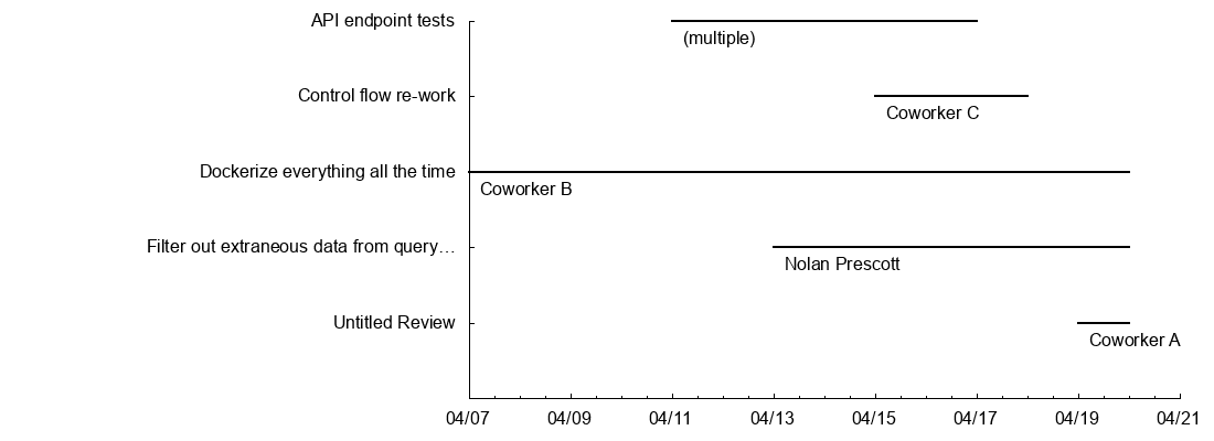
"Coworker A" 2018-04-19 2018-04-20 "Untitled Review"
"Nolan Prescott" 2018-04-13 2018-04-20 "Filter out extraneous data from query…"
"Coworker B" 2018-04-07 2018-04-20 "Dockerize everything all the time"
"Coworker C" 2018-04-15 2018-04-18 "Control flow re-work"
"(multiple)" 2018-04-11 2018-04-17 "API endpoint tests"
A few things are more awkward than in the equivalent Python, such as
splitting on whitespace — in the above SQL I have to locate the first
space using instr (in string) and then nest that in a call to
substr (sub-string). The real problem is of course that I have a
datetime as a string in the wrong format, if I rework the schema I
could eliminate the need for this entirely. I waffled a bit on trying
to declare a variable table for the twice-repeated "-14 days"
variable, but it is awkward in SQLite without defining an external
function with binding values (whereas variables are possible but still
awkward in
plpgsql).
Okay so abusing is too harsh, there's even an example of a gantt chart in the demos directory! I do think it is a bit of a stretch to create the sort of graphic I'm going for in gnuplot, which seems to be targeted at scientific visualization (even if I use it for anything else).
In order to achieve something like the existing visualization, I based my solution off the gantt chart example above. There is some setup first to define the format of the timestamps along with a function alias to save some typing at the end. I would say half of the configuration is actually down to taste, like removing some borders and disabling mirrored tic marks, even so it is reproduced in full below.
The real important part is in the definition of a "vector" for each
review, to get the "point A to point B in time" behavior. The
definition on the second to last line defines an (x,y) point and an
(x + xdelta, y + ydelta) point for the vector. To get the horizontal
lines at the appropriate height I'm using the built-in
pseudo-data-value column(0) which acts like an index on the current
row in the data table.
Finally, a second plot defines the labels, which is the reviewer name hovering just below and to the left of each line, it uses the same pseudo-column trick and then adjusts by an abitrary 0.25 because I thought it looked better.
  timeformat = "%Y-%m-%d"
  T(N) = timecolumn(N,timeformat)

  unset title
  unset grid
  unset key

  set terminal png size 1100, 400
  set output 'basic-reviews.png'
  set border 3
  set xtics nomirror
  set ytics nomirror
  set format x "%m/%d" timedate
  set yrange [ -1.00000 : * ]

  plot "$DATAFILE" using (T(2)) : (column(0)) : (T(3)-T(2)) : (0.0) : yticlabel(4) \
            with vector nohead linewidth 2 linecolor rgb "black", \
       "$DATAFILE" using (T(2)) : (column(0) - 0.25) : 1 \
            with labels left offset 1
Less visually interesting than the first example, but much faster and, I think, less complicated:
gnuplot is pretty great. While the DSL can be off-putting at first, the brevity and unbridled utility of the thing is enough to make it all worthwhile. I never regret learning how to better use it because it feels like a very sharp tool to have handy.
Doing more application-style logic in SQL is admittedly stilted, but I think it also serves as a guide to better relational data practices. In my re-formatting the data, it is awkward to parse a string to cast a date — this is probably because I should really have a datetime-type column instead. Similarly, it would be annoying to try and split out the reviewer names to just "first name" rather than "first name last name", but a better model would likely be a "reviewers" table with entries for "first name" and "last name".
In terms of practicality or utility, I am not at all upset with this iteration of the visualization. I've wrapped the whole thing in a single bash script and it is just 60 lines long. The whole thing runs in under 2/10ths of a second and requires no network calls. For reference, with the network calls and the additional logic to handle per-author colors of the horizontal "bars", the original program is about 160 lines of code that is very tightly coupled.